Neon Mex SA: Website Design & Development
Project summary
Details
- Client:Néon Mex SA
- Industry:Sign business
- Service:Web Design & Development
- Completion time:8 weeks
- Location:Lausanne Switzerland
Context
Néon Mex SA is a Swiss company founded more than 90 years ago active in the signage business. Its activity encompasses manufacturing and delivering luminous and non luminous signs to other businesses
Néon Mex SA is therefore a B2B business with the need to communicate effectively to its clients and has to make sure other companies will trust their online presence.
For Néon Mex SA we have 1st completely redesigned their website, leveraging the latest trends in web design and available technologies and 2nd implemented their website, which you can visit here.

Néon Mex' printing machine at work
What's special about this project?
In this section we will discuss a few signature features for this project and things that can interest you for your web development needs. It's a collection of interesting features and web design principles that should be implemented at your company as well. ✅
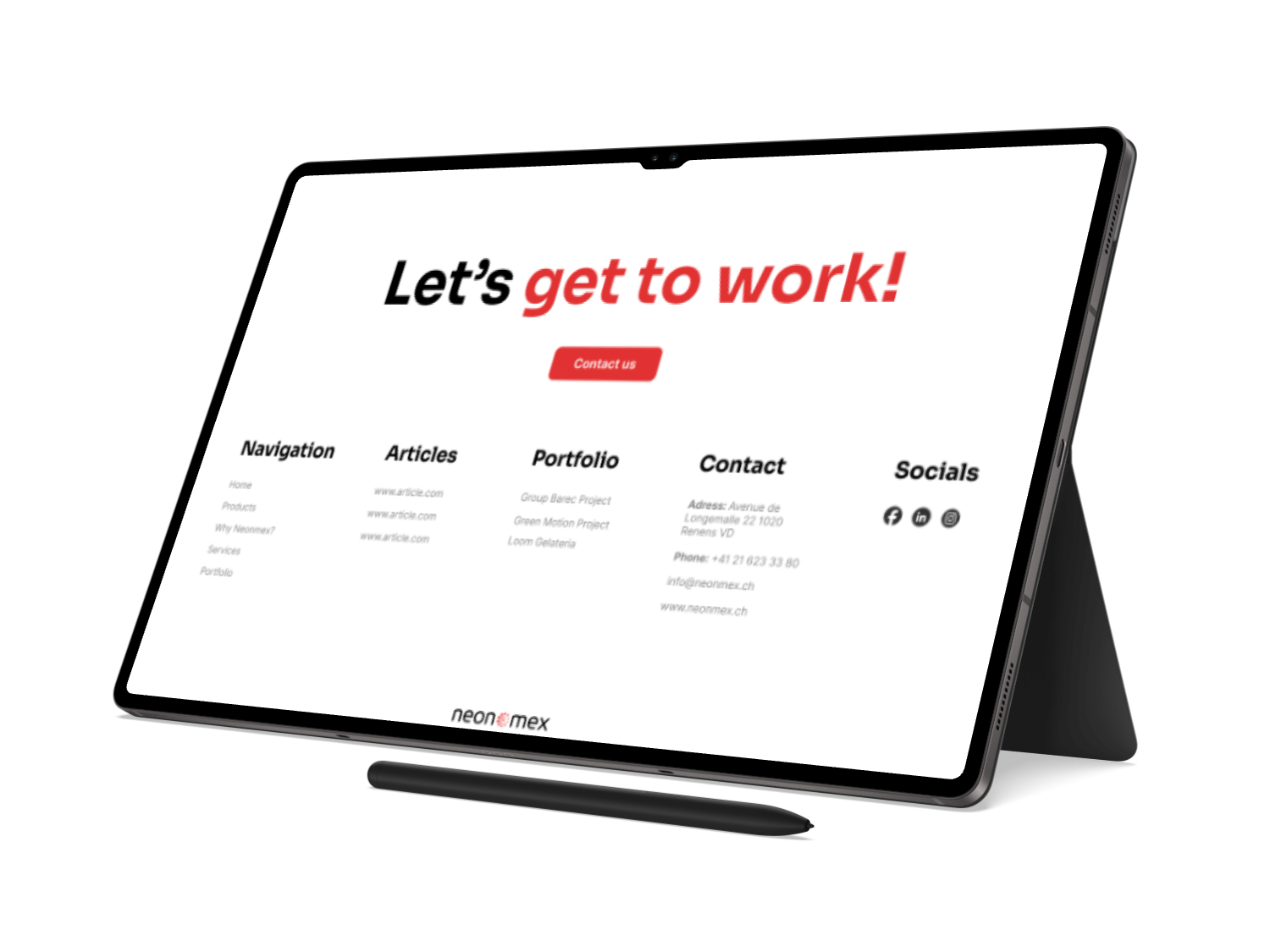
Big button footer
One of the great design trend of 2024 that will last in time is having large buttons on footers in order to attract attention and be more relevant to the user, effectively breaking the monotony of a typical flat design.
Having a large button with a large text and shiny colors will attract the user click. It's not necessary anymore to respect the paper print codes of conduct! The web is a different animal that allows for more creativity with how we present information.

We used here a large text with a large button in order to call for user actions
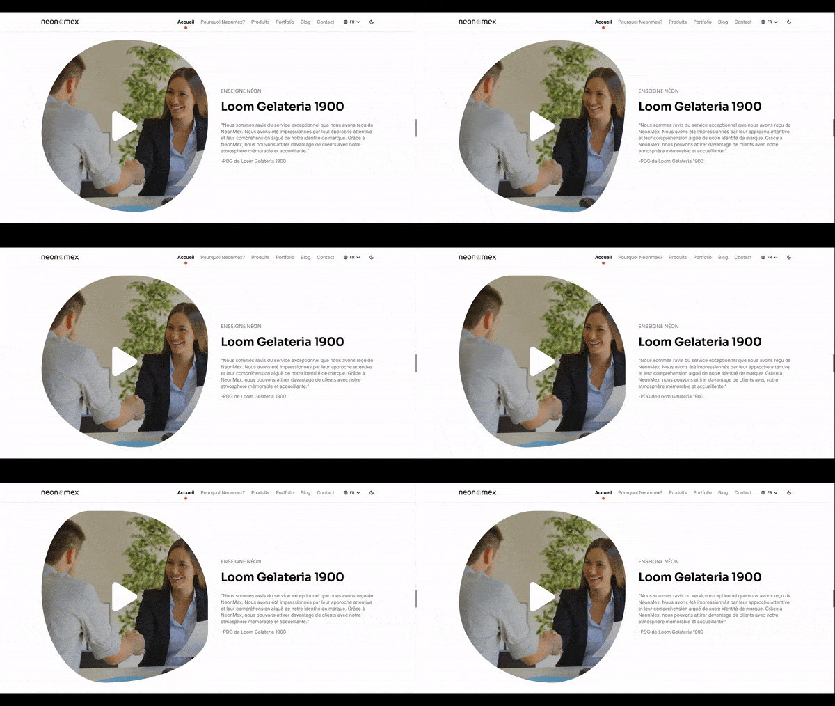
Animated Video Player
The web is more competitive than ever, that's why we need to be more creative than ever!
We took great attention to generate, structure and animate some components of the website such as this video player fully animated using tailwind. Result looks amazing 🤩
This player behaves exactly like any other player, but it calls for the user attention, retains it and calls for a click. That's the secret to a great web design!

In this gif you see the animated video player changing shape as time passes
Fully Animated Pages
The client wanted their website to feel young and dynamic. One of the solution we proposed was to animate its components and transitions to make it feel like it was always on the move. The client loved it!
By using the framer motion library, we managed to animate all components on screen and the screen transition. Visit Néon Mex' Webiste and take a look for yourself!
A few personal notes before closing
As always, it was a pleasure working with Néon Mex (a repeat customer as SleekSyntax) on their new and improved website. We are proud to say that it was done by us and know that it will allow them to pursue their quest of rejuvenation of this old brand.
The work was done quickly and effectively by collaborating with a freelance designer and assigning one of our Senior Developers to the task. Both had a very pleasant experience and the client loved them!
We would like to extend our most sincere thank you to Néon Mex' team for working with us and wish them all the success they deserve 👏🏼
What now?
If you liked what you saw, or if you don't but have different ideas on what you want, feel free to reach out to us now! We will reply to you within 2 hours.
Webiste: Organization website
Originally published: 2025-01-29T12:53:25.867Z
Last updated: 2024-08-27T20:32:10.028Z

